library(dplyr)
Attaching package: 'dplyr'The following objects are masked from 'package:stats':
filter, lagThe following objects are masked from 'package:base':
intersect, setdiff, setequal, unionlibrary(ggplot2)library(dplyr)
Attaching package: 'dplyr'The following objects are masked from 'package:stats':
filter, lagThe following objects are masked from 'package:base':
intersect, setdiff, setequal, unionlibrary(ggplot2)A YAML header, which sets formatting parameters for the whole document
Code chunks, which allow you to write and run code
Text with basic formatting options (e.g., headers, italics, hyperlinks)
A code chunk is a space in your .Rmd that is designated for writing and running code. This is in contrast to the main body of the .Rmd file, where text cannot be interpreted as code.
You can create a chunk several ways. You can create one by manually typing ```{r}, then ```. You type code in between these delimiters. You can also insert a code chunk by clicking the small green box with a “c” and a plus sign in the top-right corner of the working pane. You can also use a keyboard short cut: Ctrl/Cmd + Alt + I (this is my preferred method, since it’s usually the fastest).
Inline code allows you to insert runnable code into text so that only the code output is included in the rendered markdown file. It is not suited to running complex code, this should instead be performed in a code chunk
ggplot(data = mpg) +
  geom_point(mapping = aes(x = displ, y = hwy, color = "blue"))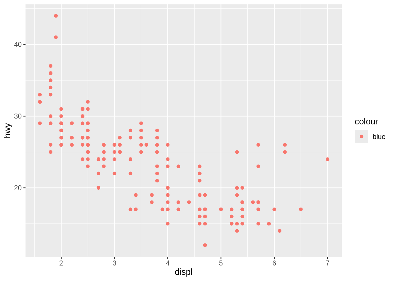
In the provided code, color="blue" is included inside the mapping aesthetics, which means R is interpreting the code as: “The color of each point should be determined by the following property of the data:”blue”“. Since”blue” isn’t a property present in the mpg dataset, all points end up the same color, and the color legend shows that they all map to the same property.
An example of when this syntax would be appropriate is setting the point color to map to the car’s model year:
ggplot(data = mpg) +
  geom_point(mapping = aes(x = displ, y = hwy, color = year))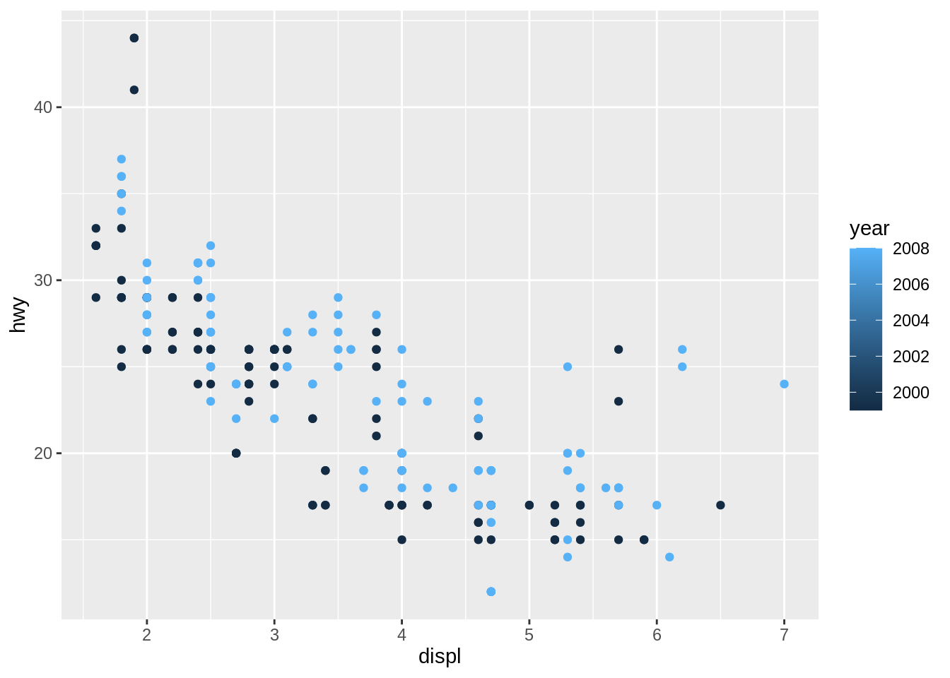
To correctly plot highway mileage as a function of engine displacement, with all points shown in blue, you need to move the color argument outside of the mapping aesthetic.
ggplot(data = mpg) +
  geom_point(mapping = aes(x = displ, y = hwy), color = "blue")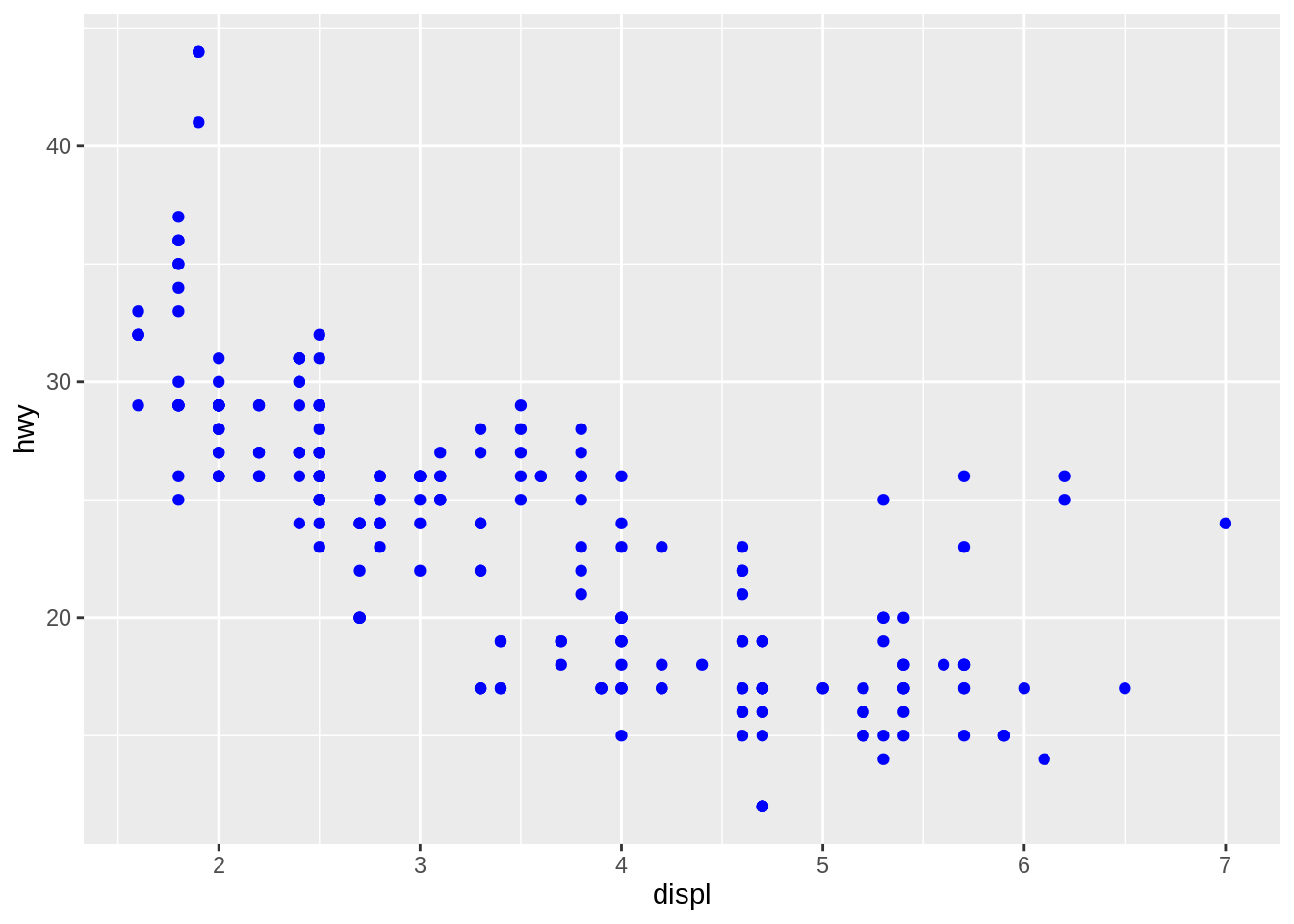
I think I’m good so far!